Outfest is an LGBTQ-oriented nonprofit that produces two film festivals, operates a movie streaming platform, and runs educational services for filmmakers in Los Angeles. The new brand identity reflects the different incentives and opportunities Outfest provides to up and coming queer filmmakers.
The audience for this project is film enthusiasts as well as queer filmmakers. Outfest is one of the biggest LGBTQ+ film festivals in the United States and an updated visual identity helps highlight their significance.

The logo form is inspired by spirographs and generative typography. The symbol is formed by numerous lines, which represent the uniqueness of each individual and connections between people through film.

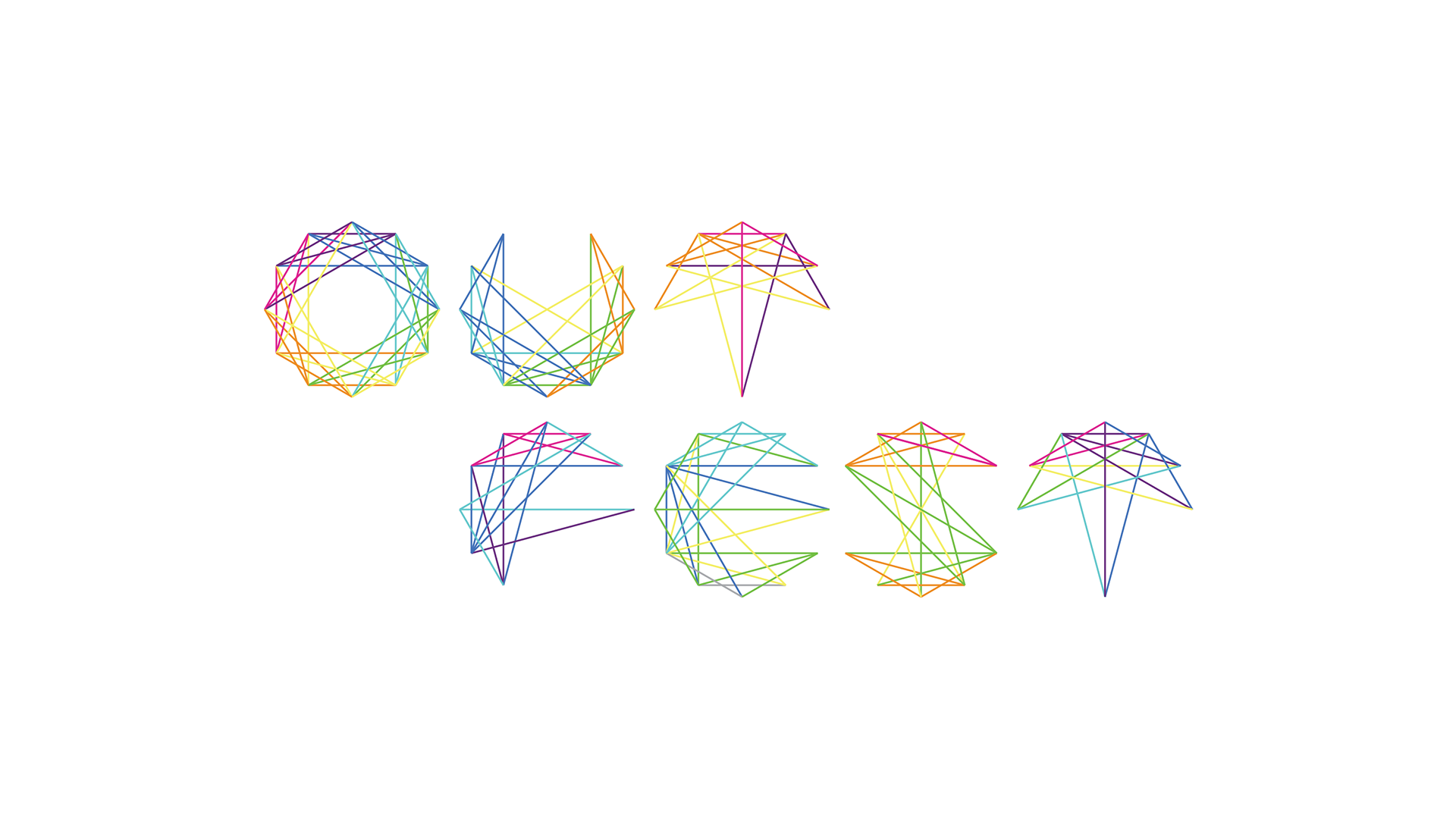
Alternate form of the logo. 26 letters can be formed using the spirograph grid.

Using p5.js, the logo animates and transforms into unique abstract shapes in sequence. It emulates the transformative nature of each human being. This form is featured on the website, business cards, and interactive posters.

The front of the business card contains a monogram of initials using the logo grid, while the back is a generated form derived from the logo.

Because of the adaptability of the identity, I created posters that feature generated graphics. These graphics act as a code and each code would embed a different film. The audience can scan the interactive poster and watch a trailer of the embedded film through a mobile device.
Transmedia Installation
This transmedia installation would be located outside the film festival. While viewing and interacting with this space a visitor would explore different films and connect with other visitors. The goal is to provide the public with a sense of connection and celebration of individuality.
Outfest Fusion
Outfest Fusion is Outfest’s people-of-color-focused and international film, music, and storytelling festival. This micro identity aims to further promote individuality and dimensionality in representation, while maintaining brand recognition through its familiar yet varied graphic approach to the macro brand.

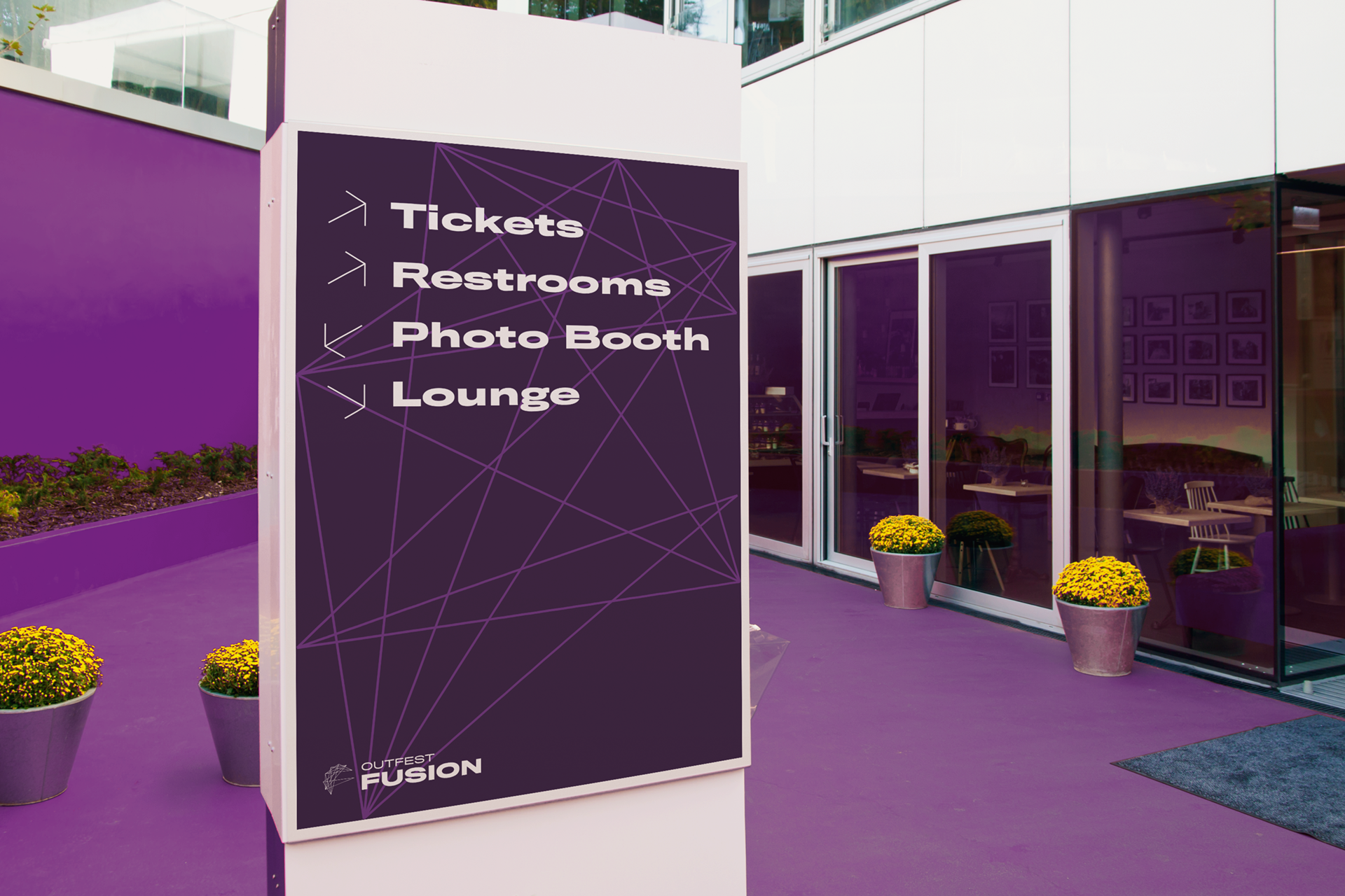
The logo is constructed using the grid of the macro brand logo. Like the "O" logo, this "F" logo can also transform and be adapted in many different media.

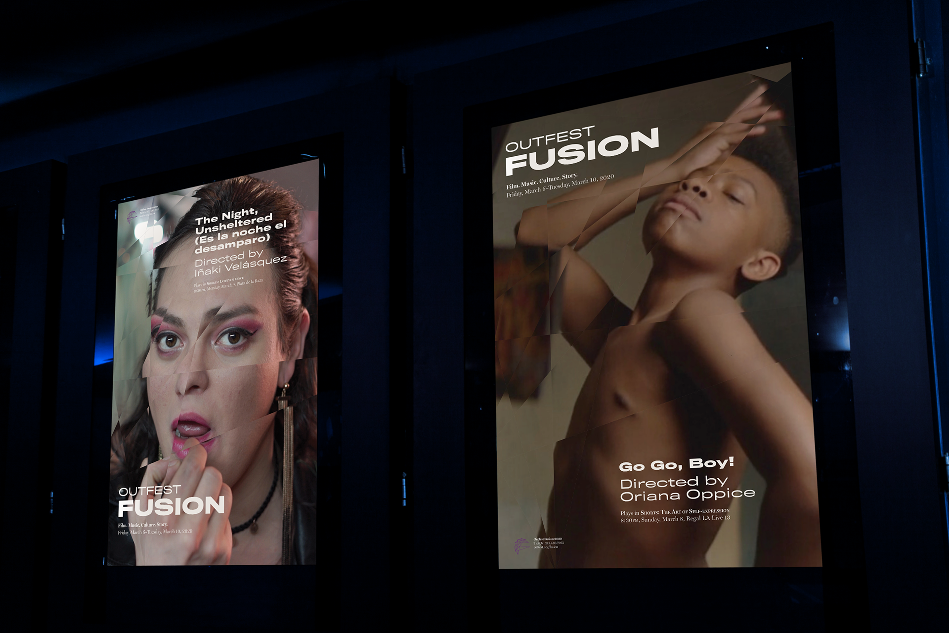
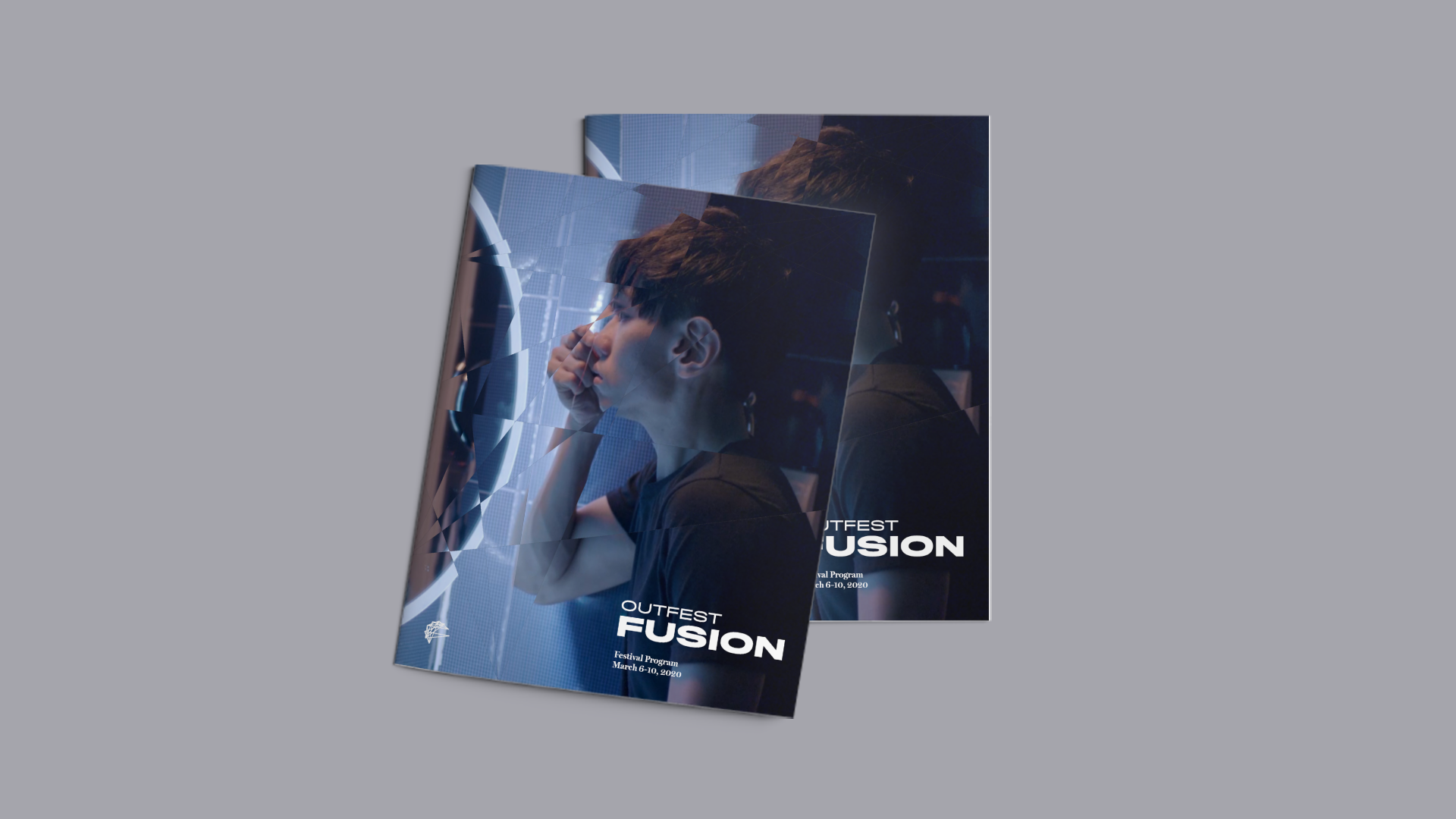
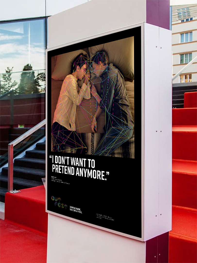
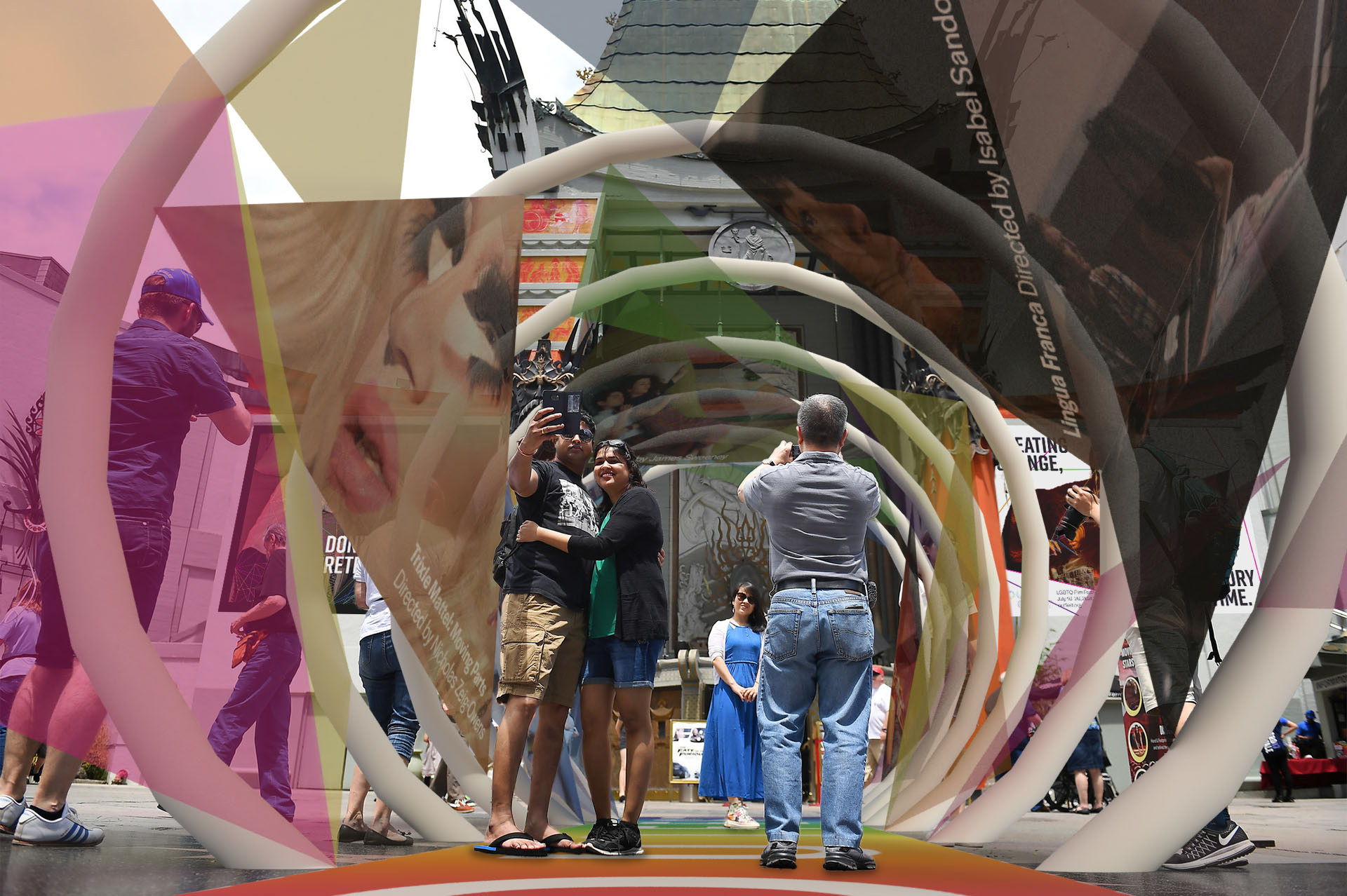
The images in these posters are diffracted using the "F" logo, which represents the multi-faceted nature of BIPOC LGBTQ characters and storytellers.

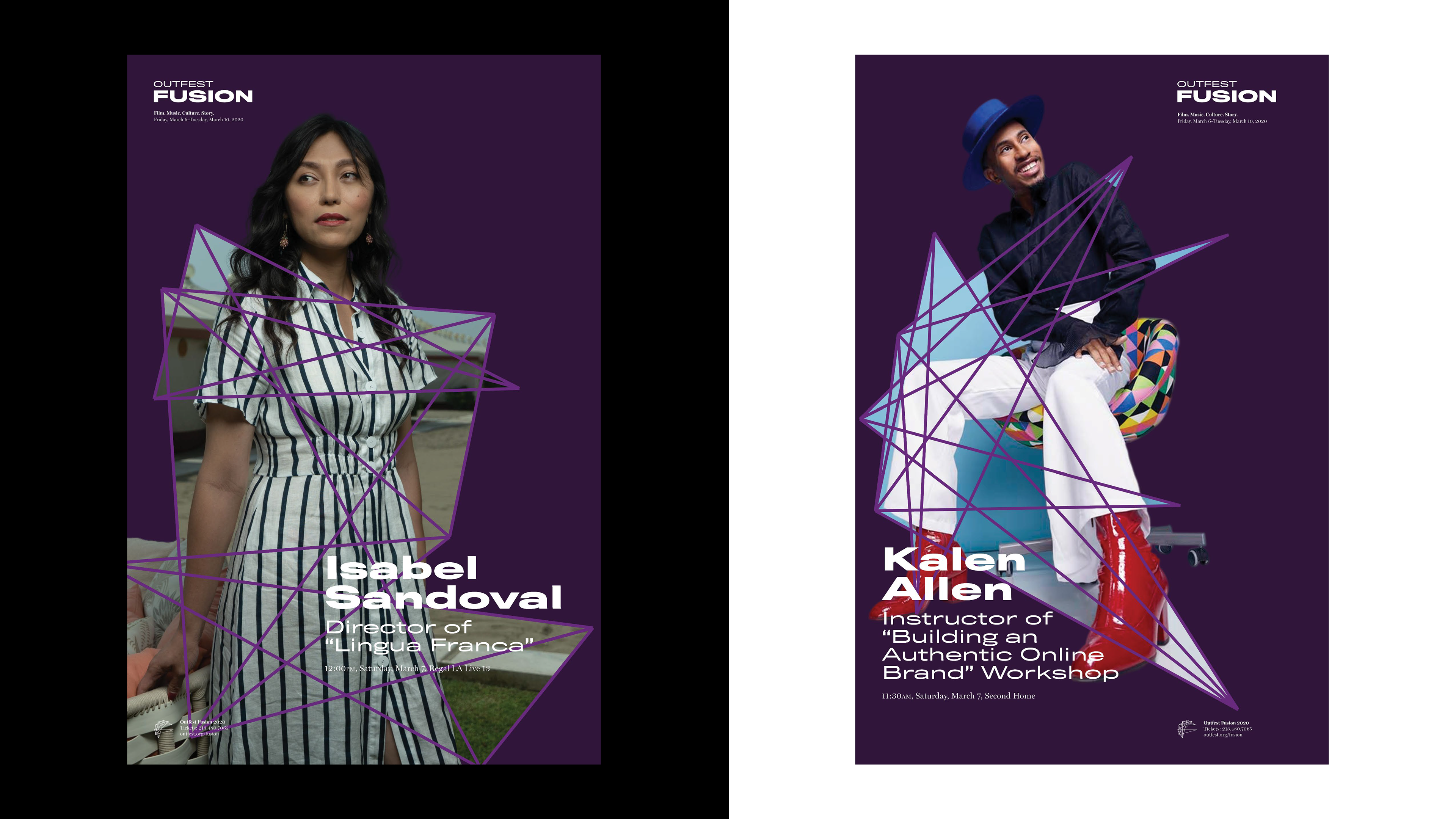
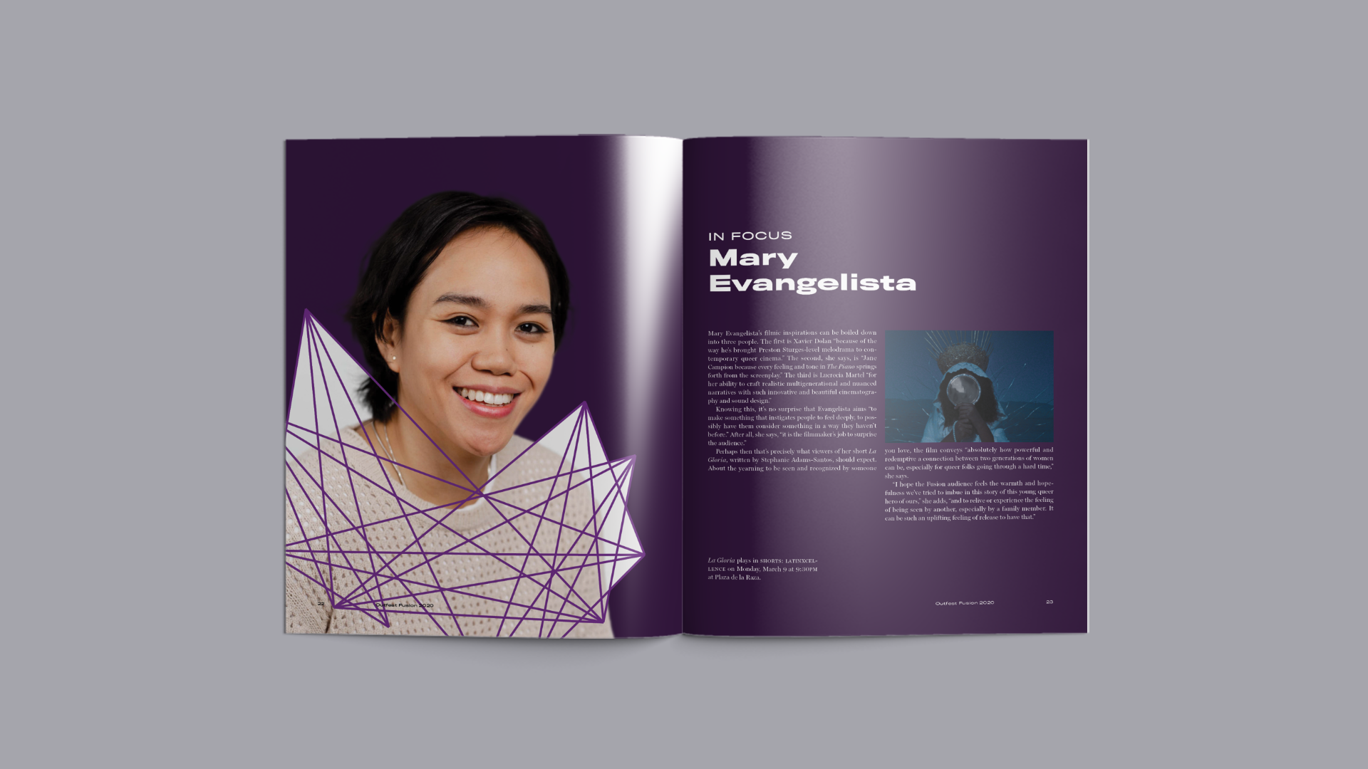
For posters that feature the creators, an abstract letterform of their last initial created using the spirograph grid is placed on top as an image treatment.

Along with the micro identity, a program brochure is created to deliver information to festival attendees. This brochure includes film descriptions, creator interviews, special events, workshop information, and a timetable.

Other Projects

Back to Top